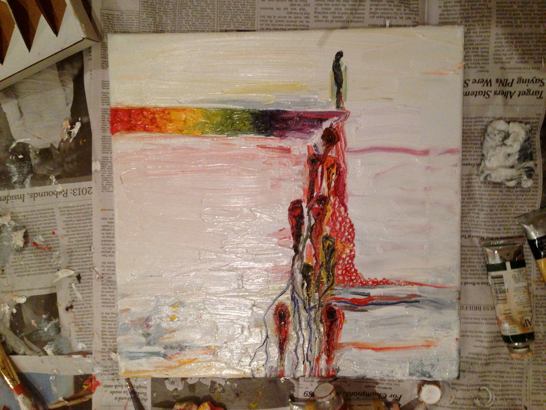
Over Christmas break, my friend and I have been painting together. I've been working on some abstract art!
| Willa King |
|
|
Over Christmas break, my friend and I have been painting together. I've been working on some abstract art!
0 Comments
 This is the one I've chosen to do my Impressionist painting after.   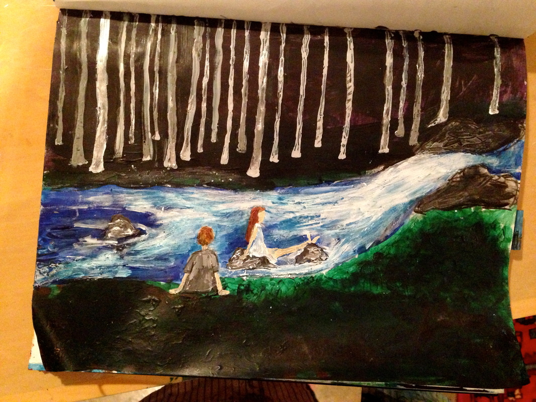 I've been doing more paintings this week. I started working on this one. 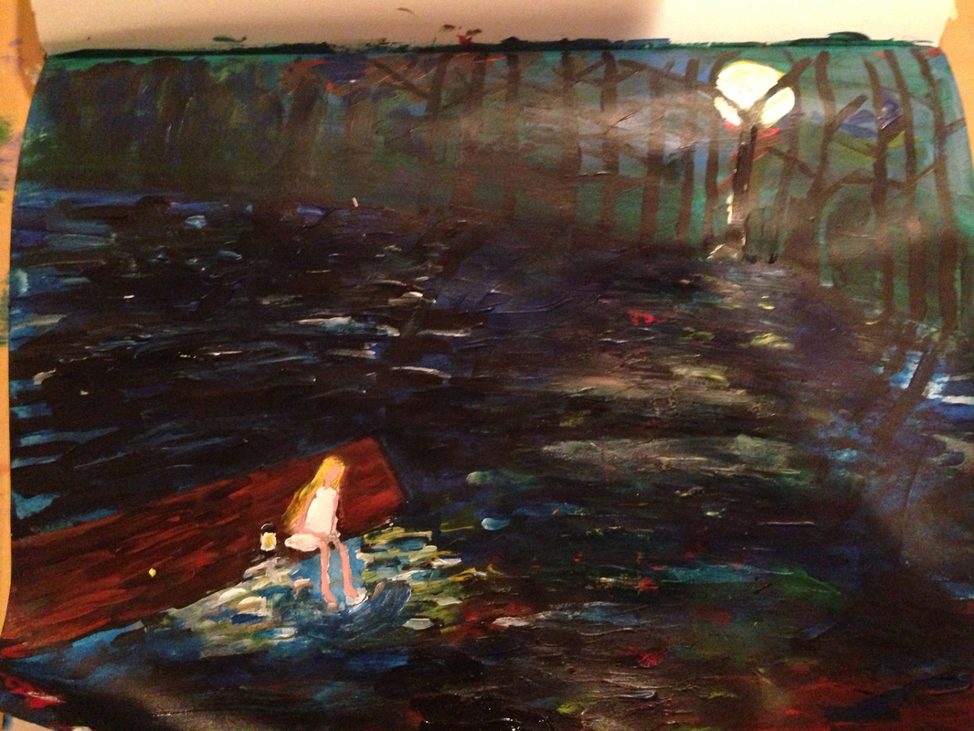
I started this painting in my sketchbook. I have been painting and sketching a lot this week.
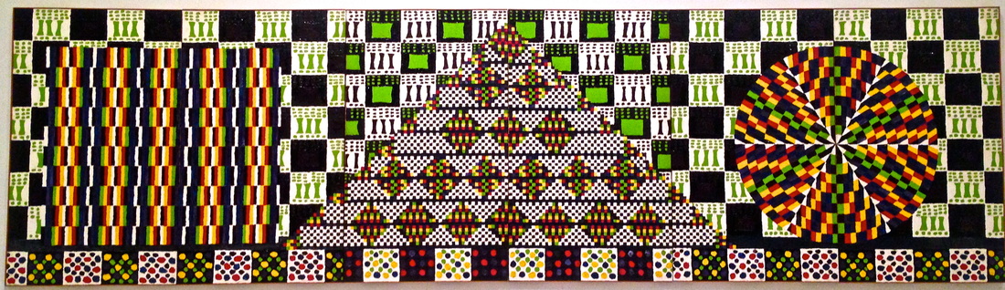
Non-Objective Work: Honor Pythagoras, 1964, oil on canvas, Alfred Jensen. Observations and notes: -painted with thick brush strokes -color was used to create a sharp contrast -used black next to white, yellow next to bright red and blue, and bright lime green and purple on black -really nice, thick texture -marks are specific and rigid and stay within their lines (not smudged or mixed) -when looking at the painting from far back, it looks really neat and clean, but when taking a closer look, you can see the thick blotches of paint which give it a wonderful, rough texture -distinct shapes and bright colors are the most emphasized in this work, to symbolize specific things that Jensen saw behind both art and science: feeling and thinking
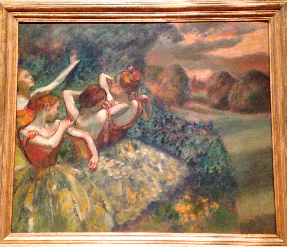
French Impressionists: Four Dancers, oil on canvas, 1899, Edgar Degas, French 1834-1917, Chester Dale Collection, 1963. Observations and notes: -big but soft brush strokes -what i found especially dramatic was the movement you can see in the ballerinas' arms -there are faded colors and faded light in the background, making it more hazy and blurry -the light on the ballerinas is brighter, and the colors (especially the pink and yellow on the dresses, the orange-ish brown hair, and rosy cheeks) are brighter and more life like -the way he does this makes the ballerinas come to life, and you can see their movement -Degas does foreground on the left side, with some kind of tree covering what's behind it, and then the background is on the right side -the curve of the tree and the ballerina's arm that is sticking straight up seems to lead the viewers eyes around the painting
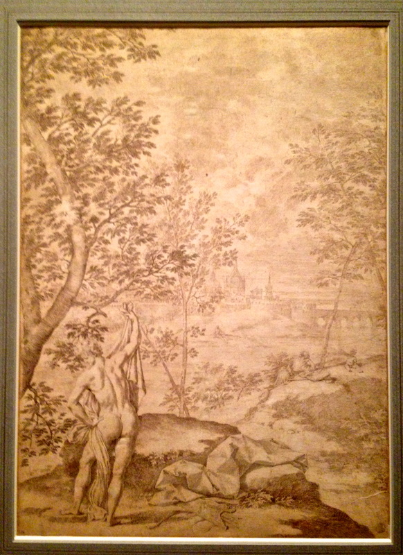
Old Masters: Donato Creti, Italian (1671-1749), Apollo Standing in a River Landscape, 1702/1730, pen and ink, The Armand Hamer Collection, 1978. Observations and notes: -rather than actual shading, he used a lot of really small, fine marks -effective use of foreground, background, and middle ground: circular motion -contrast decreases as it goes further into the background -pretty light marks overall -effective use of rule of thirds
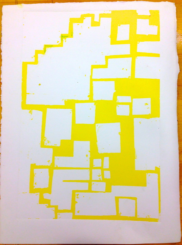 We've been working on our abstract prints, and this is one of mine so far. I am trying to do one similar to the marker drawings with bright colors and squares that I did in my sketchbook. To do this print, i had to cover the whole paper up with tape except for the parts that i wanted to be yellow. I inked it all over with yellow ink, and then i took off the tape, leaving those parts white. I ran it through the press, and it came out like this. |
AuthorMy Name is Willa King, I am a sophomore at Maggie Walker Governor's school, and I am an Art 3 Student. Archives
June 2016
Categories |
 RSS Feed
